Theming
Theming allows you to change the UI of your project by using CSS stylesheets called themes.
In this guide, you'll have an overview of theming in FastStore, explaining the concept of theming, the use of global and local tokens, the structure and architecture of themes, and the naming scheme for design tokens.
What is Theming?
Theming refers to the process of customizing the UI of a project by using CSS stylesheets called themes.
Themes consist of configurable design tokens that define the look and feel of the UI.
By modifying these design tokens, you can change the colors, typography, spacing, and other visual properties to create a unique look and feel for your store.By default, every FastStore project comes with the Brandless theme, a basic theme to start your FastStore project.
However, you have the option to use one of the available themes or create a custom theme.
You have the flexibility and freedom to style the theme by overriding it using global or local tokens, or by starting from scratch using your preferred styling tool.
Global and Local Tokens
There are two types of design tokens: global tokens and local tokens.
| Design Token name | Description |
|---|---|
| Global tokens | Structural styles that define the behavior and design patterns of components at a system-wide level. They handle interactions such as showing or hiding dropdown menus and toggles. |
| Local tokens | Design tokens specific to individual components. They control the appearance of graphical elements within components, including typography, colors, borders, and spacing. |
By configuring global and local tokens, you can create consistent visual styles across your application while allowing for customization at both the system and component levels.
Brandless and the Theming structure
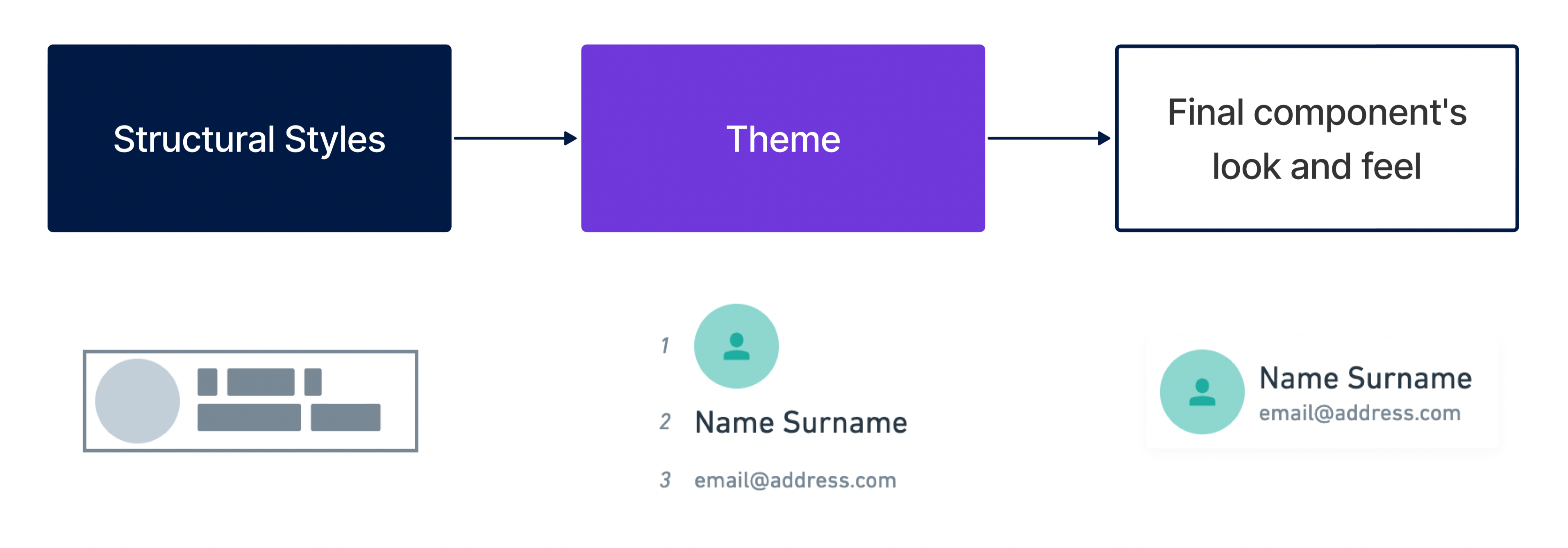
Brandless, the FastStore default theme, is a themeable structure made of two complementary layers:
a useful and assorted library of templates for the components and sections, the Structural Styles, alongside a comprehensive set of design tokens to further customize them, the Theme Layer.
These two layers are the two main parts of the theming structure:
Structural Styles provide the foundational design patterns and handle essential interactions across components. They establish the basic behavior of the UI.
The Theme layer is where the branding and customization happen. It allows you to control design elements such as typography, colors, images, borders, and spacing through design tokens. By adjusting these tokens, you can achieve a distinct visual identity for your application.
You have the flexibility to customize or override the styles defined in the Structural Styles or Theme layers. Alternatively, you can start from scratch and create your own styles without relying on pre-existing FastStore CSS.
Understanding the Structural Styles and Theme layers enables you to create visually appealing and unique user interfaces while maintaining control and flexibility.
Theming architecture
The theming architecture is structured as follows:
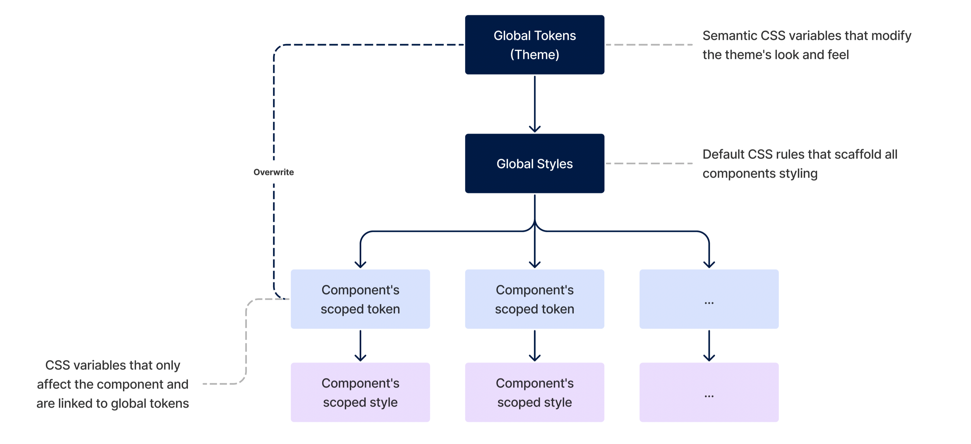
Components
These are fully-featured UI blocks that form part of the larger system. Each component has its own CSS stylesheets called Templates, which determine its appearance and arrangement.
Local Design Tokens
Components rely on local design tokens, which are specific to each component. These design tokens define the visual properties of the component, such as colors, typography, and spacing.
Global Design Tokens
Local design tokens are connected to global tokens, forming the Theme. Global tokens are responsible for setting the overall visual style of the entire system. They affect the appearance of multiple components and ensure consistency across the application.
The interaction between components, local design tokens, and global design tokens creates a hierarchical structure allowing modular theming and customization.
Design Tokens naming scheme
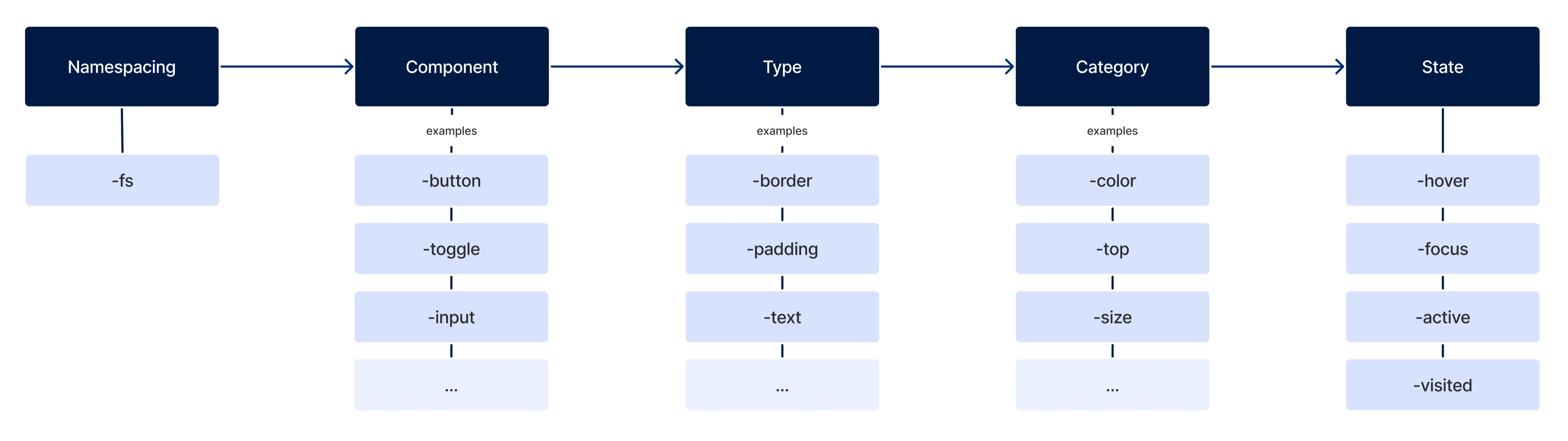
Design tokens follow a specific naming scheme to ensure predictability and cohesiveness. The naming scheme consists of different parts:
-
Namespacing: Indicates the origin of the token. For example, in
--fs-color-main-0, the--findicates that the variable belongs to FastStore-related styles. -
Component: Represents the semantic meaning of the token.
-
Type: Specifies the type of property the token affects, such as color, typography, or spacing.
-
Category: Defines the category within the type that the token affects.
-
State: Indicates the interactive state of the token.
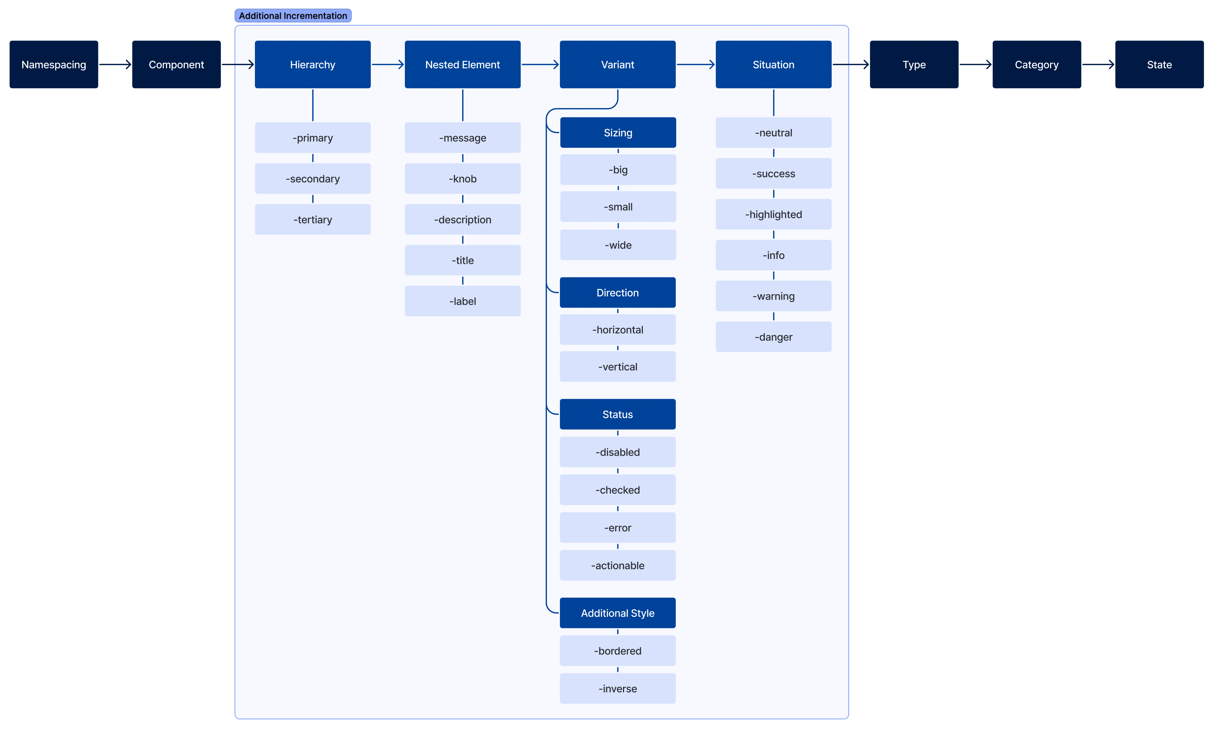
Additional increments can be added to the token's name, such as hierarchy, nested element, variant, or situation, to differentiate tokens and provide more context.
- Hierarchy: Define its tier.
- Nested Element: To sytle elements contained inside the component.
- Variant: What differentiate it from the default.
- Situation: When they should be used.
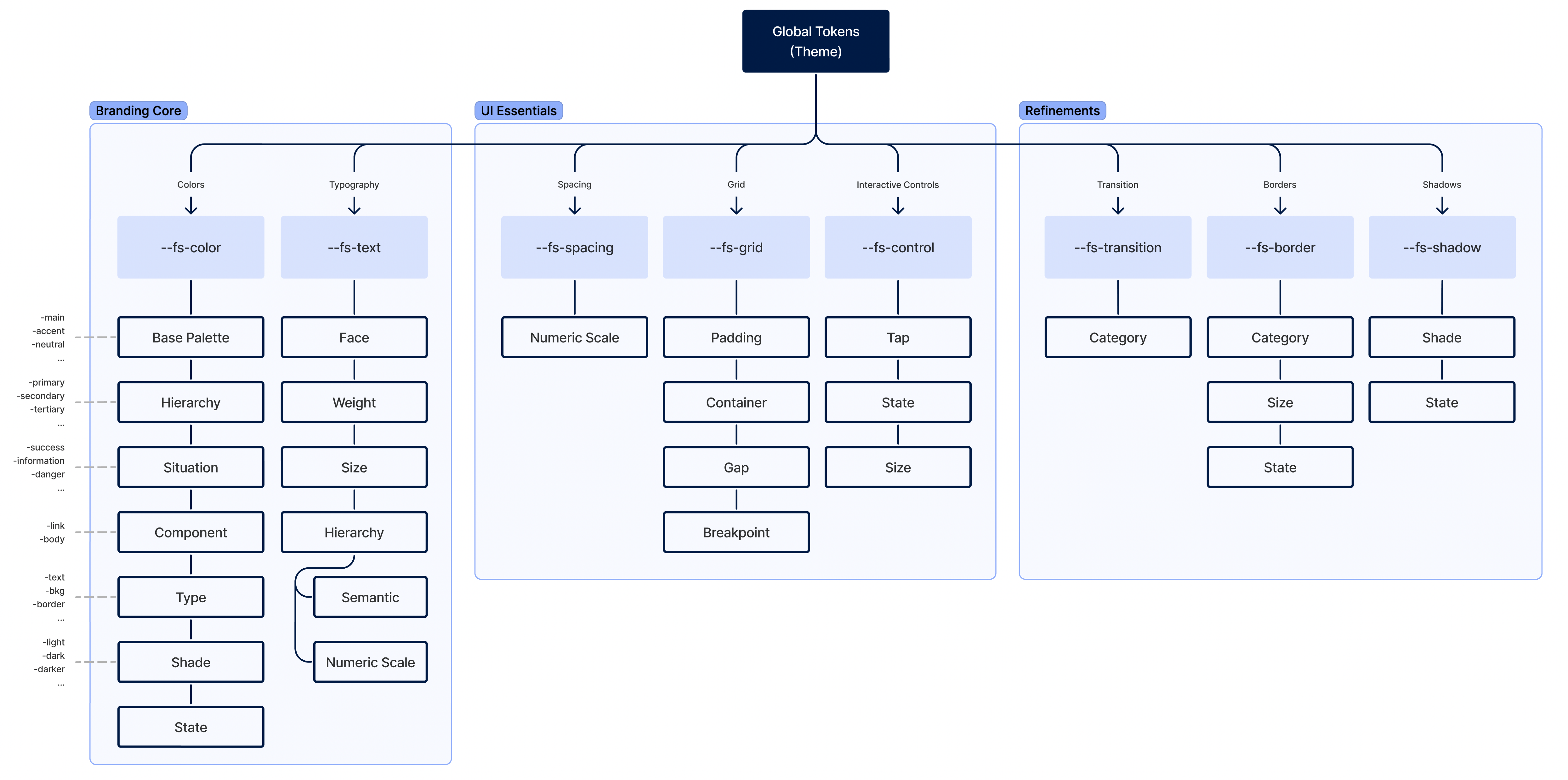
Theme (or global design tokens)
Global design tokens are parameters that affect all UI look 'n' feel. They are the main configuration file of a Theme. It's constituted of three main groups:
- Branding Core
- UI Essentials
- Refinements