Overriding native components and props
In this guide, you will learn how to modify a component's behavior using additional properties in your store code and create new components by overriding their native equivalents.
These features are useful when you need a customized behavior for a specific component not available in the FastStore native options.
We highly recommend considering overriding props or utilizing the theming tools provided by@faststore/coreto achieve the desired behavior. Overriding a component inside a section will compromise the existing integration developed in@faststore/coreby losing updates for that component.
Before you start
Ensure you have a functioning FastStore project
Make sure you have a functioning FastStore project after following the FastStore onboarding and setting up the project.
Check the version compatibility of your faststore/core package
This feature is available for stores using
@faststore/core 2.1.36 version and above.Choose a native section and the component you want to customize
The
@faststore/core package provides a set of native sections, each consisting of different components with unique functionalities.
Refer to the List of native sections and overridable components to explore available native sections.Consider two aspects for this feature
Keep in mind the following aspects when using this feature:
-
This feature is experimental: The feature may not function as expected.
-
Some sections contain multiple instances of the same component: When overriding a component or passing additional props to it, consider that all instances will be affected by this change.
Override native component's props
Overriding props allows you to customize a component's behavior while preserving its native integration. This approach is useful when you want to modify specific aspects of a native component.
All component customizations in FastStore are performed within a section, and to override props, you need to choose the desired native section and component from the List of available native sections.
For this guide, we'll use the
BuyButton component to make the customization.Here's how the initial component looks like with the
size prop set as regular in the PDP (Product Details Page):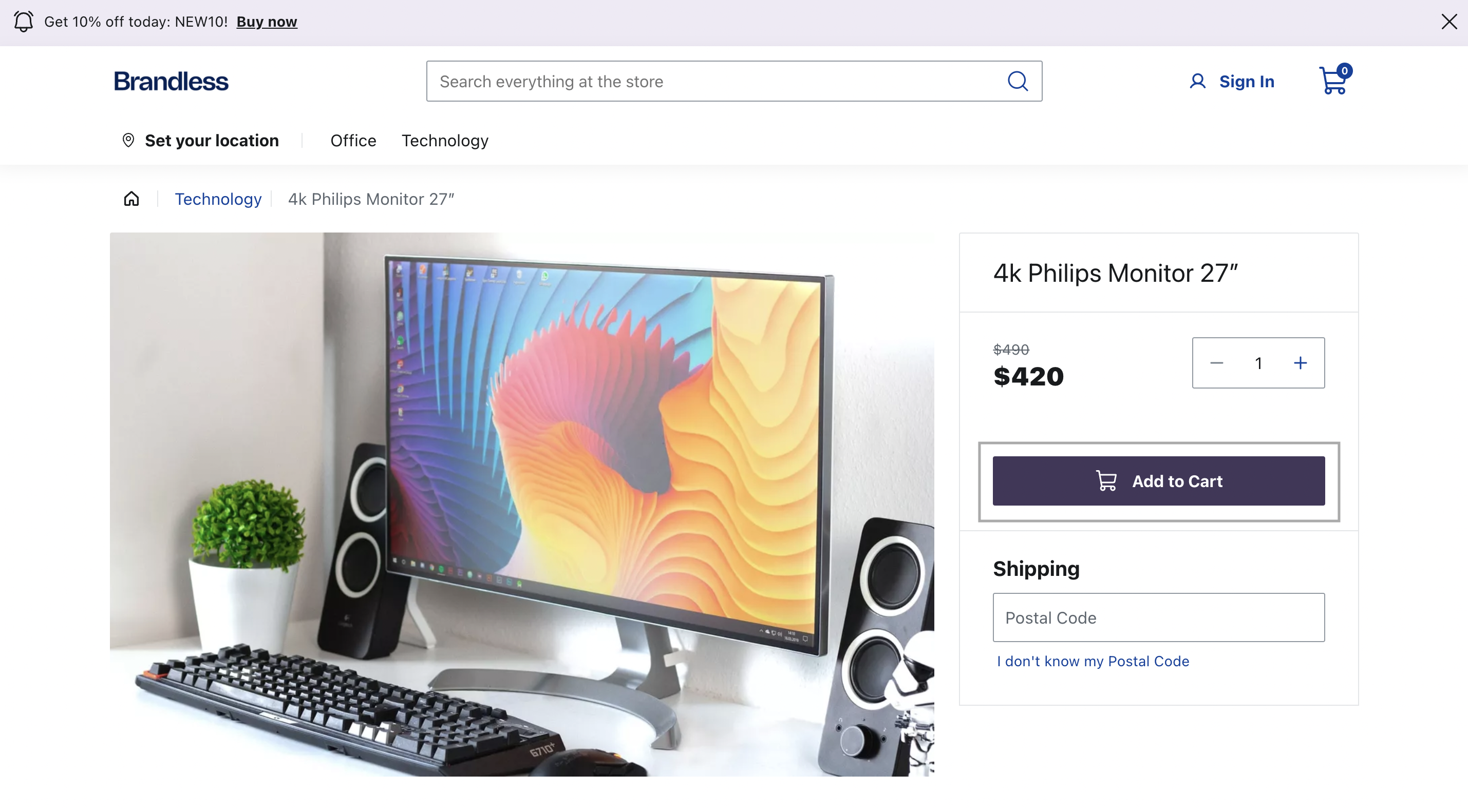
Step by step
Step 1 - Setting up the overrides folder
- After choosing a native section to be customized from the list of available native sections, open your FastStore project in any code editor of your preference.
- Go to the
srcfolder, create thecomponentsfolder and inside it, create theoverridesfolder. You can run the following command to create them:
macOS and Linux
Windows
- Inside the
overridesfolder, create a new file named after the chosen native section. For example, if you chose theProductDetailssection for customization, create a new file namedProductDetails.tsxunder thesrc/components/overridesdirectory.
macOS and Linux
Windows
- Copy and paste the following code snippet into the file:
_10import { SectionOverride } from '@faststore/core'_10_10const SECTION = 'ProductDetails' as const_10_10const override: SectionOverride = {_10 section: SECTION,_10 components: {}_10}_10_10export { override }
Change the value of theSECTIONvariable to the name of the section you want to override. In the given example, we set theSECTIONvariable toProductDetailsto override this specific section.
- Save your changes.
Step 2 - Setting up the override
- Open the
ProductDetails.tsxfile created in the Setting up theoverridesfolder step and add the following code:
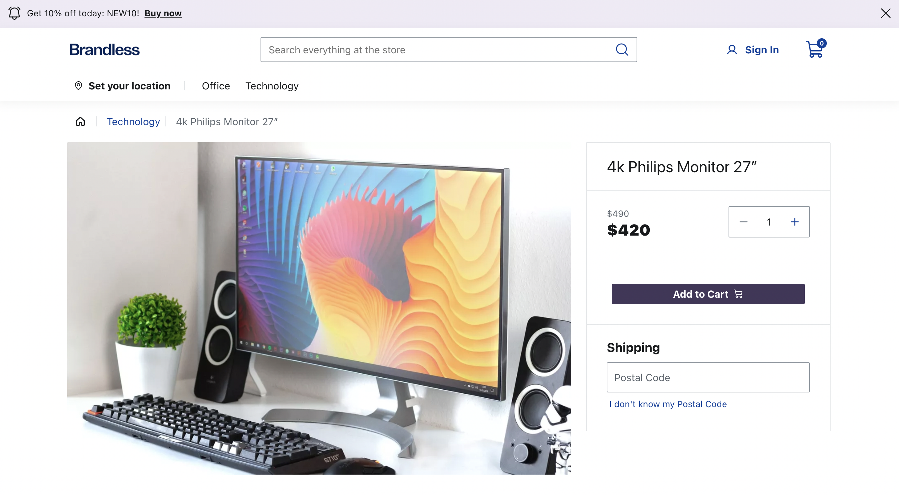
This code overrides the
BuyButton props size and iconPosition. You'll see a smaller button than the initial one and the cart icon positioned on the right side.- Run
yarn devin the terminal to start the development server. Access the provided localhost URL in your browser and go to the product details page to see the updatedBuyButtoncomponent:
Remember: props changed via Headless CMS overlap the changes made through override. For example, if you change a prop through override and also change it using Headless CMS, the final prop's value will be the one added using CMS.
Overriding a native component
Now that you know how to override a component's prop, learn how to override a native component to use a custom component.
For example, you may want to replace the current
BuyButton component from the ProductDetails section to meet your business needs.Currently, when the
BuyButton is clicked, it opens the CartSideBar as its default behavior: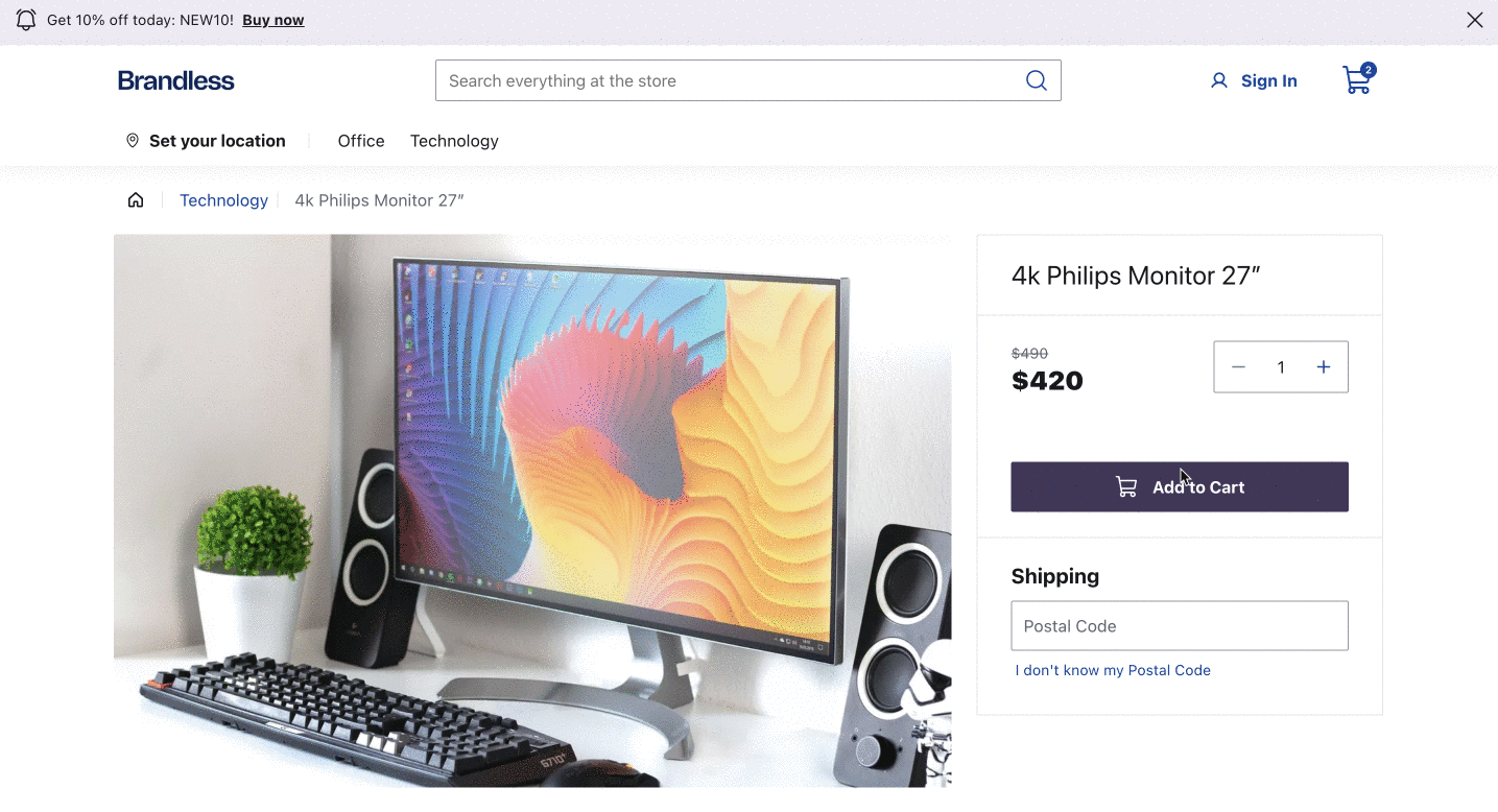
For this guide, we will create a custom Buy Button that, once you click on it, displays an
alert for the customer and the custom Product Title.BuyButton
Step 1 - Create your custom component
- Inside the
componentsfolder, create a file namedCustomBuyButton.tsx. If you haven't created thecomponentsfolder yet, see the Setting up the overrides folder step.
macOS and Linux
Windows
When creating a custom component, it's important to choose a name that distinguishes it from the native component. For example,Custom{ComponentName}=CustomBuyButton.
- Add the following code into
CustomBuyButton.tsxfile:
The provided code imports the Button component from the @faststore/ui package. The code defines the
CustomBuyButton component that displays an alert message when clicked based on the behavior we want.
However, you have the flexibility to customize the component to achieve a different behavior if needed.Step 2 - Overriding the component
- Choose a component to override from the list of overridable components of each native section. In this example, we are overriding the
BuyButtoncomponent in theProductDetailssection. - Navigate to
src/components/overridesthat we've created before. - Open the
ProductDetails.tsxfile and update it with the following code:
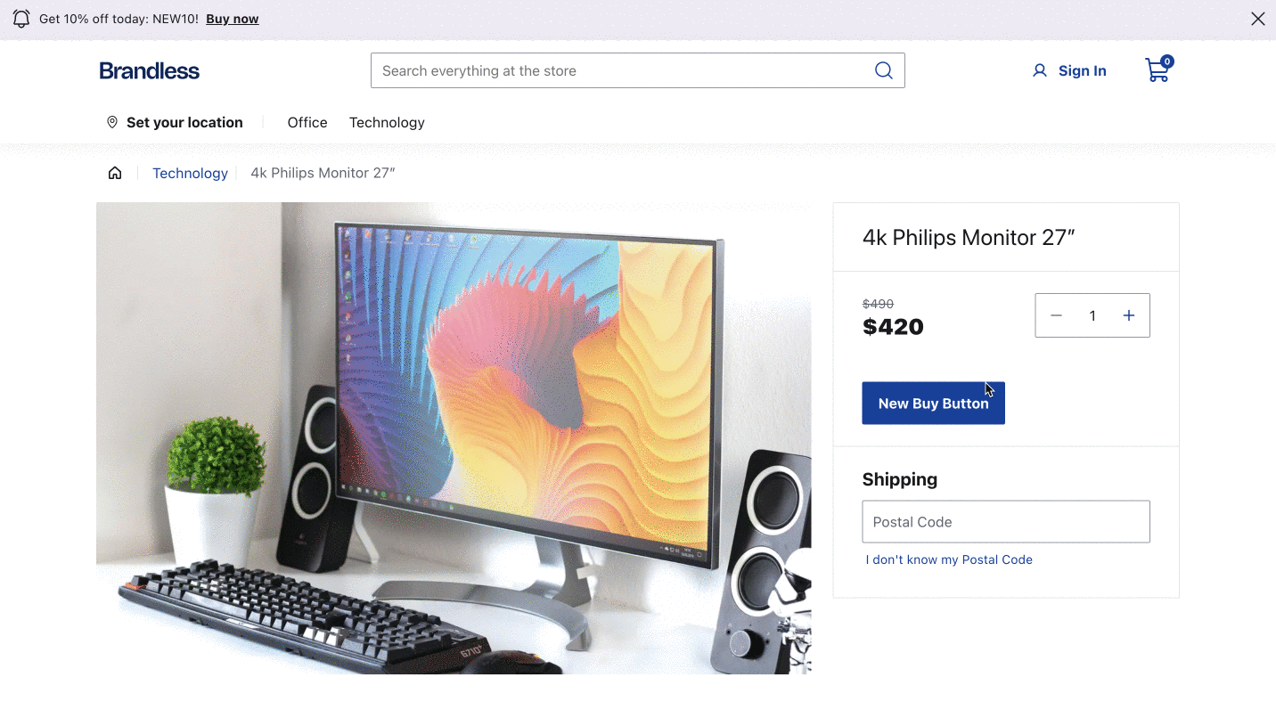
- Run
yarn devin the terminal to start the development server. Access the provided localhost URL in your browser. Navigate to the product details page, you should see the CustomBuyButton component in place of the previous BuyButton component.
By using your custom component, you may need to customize it from scratch. See Customizing a New Component when using Override guide for more details about styling it.
Product Title
- After Setting up the overrides folder, inside the
componentsfolder, create theCustomProductTitle.tsxfile. - Add the following to the file:
_12import React from 'react'_12import { ProductTitle, Tag } from '@faststore/ui'_12_12_12export default function CustomProductTitle() {_12 return (_12 <section>_12 <ProductTitle title={<h1>New headphones</h1>} />_12 <Tag variant="warning" label="On sale" onClose={() => {}} />_12 </section>_12 )_12}
This code creates a custom
ProductTitle component displaying the product title and a tag indicating that the product is on sale.- In the
overridesfolder, create theProductDetails.tsxfile. - Add the following code to the
ProductDetails.tsxfile to render the newCustomProductTitlecomponent.
_14import { SectionOverride } from '@faststore/core'_14_14import CustomProductTitle from '../CustomProductTitle'_14_14const SECTION = 'ProductDetails' as const_14_14const override: SectionOverride = {_14 section: SECTION,_14 components: {_14 ProductTitle: { Component: CustomProductTitle },_14 },_14}_14_14export { override }
- Run
yarn devin the terminal to start the development server and access the provided localhost URL in your browser.
Overriding components while maintaining default configuration
In specific scenarios, when you want to keep the default integration or component configuration partially, you can use prior integrations within your custom component.
Note that this will only work if your custom component's props are compatible with the overriding component. We encourage using FastStore UI components to leverage existing features, basic styles, and better props compatibility.
Building upon our previous example, we could pass the
BuyButton props to our new component.
This approach allows us to incorporate the icon and cart sidebar integration while introducing additional functionality to the onClick function, such as triggering an alert or sending an event to analytics.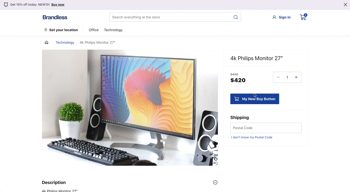
In this example, when clicked, the
CustomBuyButton component will display an alert message and then open the CartSideBar, keeping its default behavior.This feature can open up numerous possibilities for exploration and customization in your store. Happy exploring! 🎉